FREEMIUM EXPERIENCE
Redesigning & Reimagining the Freemium experience
Intel Security - To comply with NDA, and not lose my job, I have removed or obscured all confidential information.

UNDERSTANDING FREEMIUM
Free+Premium

Freemium
Freemium is the funneled term for 'Free' and 'Premium'. It's model is to give away your basic product for free
Freemium makes money by having certain features that the user must pay for, in order to use them

A well-developed freemium model can be a constant source of revenue, than paying once for the product
FREEMIUM IN THE SECURITY SPACE
It's important to keep in mind that freemium is just another business model, and like any business model, it works for some products and doesn't for others. So, it is always best to see if your product is flexible enough to match the model. If it doesn't, can we accommodate it to do so and if we do accommodate, is it worth it?
Fortunately, in the security business, almost all companies have some form of free version of their software. Either starting from a fully loaded free trial for a limited period of time, and then switching into a free product, if the user hasn't paid or, starting from the free state itself, and asking for money once they have detected a virus.


COMPANIES THAT NAILED FREEMIUM

Skype is one company that has constantly generated millions of dollars in profit, even while maintaining an almost completely free product

King development studio designed an engaging and addictive freemium game, which led them to earn more than $500,000 a day

When Niantic released PokemonGo, the whole world went crazy. It was free to download and play, and yet earned $2M per day
All 3 companies stayed true to the core principle of freemium, by giving away the product completely for free, and then introducing elements in the product that the user would have to pay for to achieve something new or faster
UNDERSTANDING OUR USERS

In-Person Interviews
After recruiting about 12 users, we tried to understand why users were reluctant to pay for security software, and how they protect themselves without any anti-virus, while browsing the internet or downloading something
Uninstaller Survey
We introduced a small one question survey in our uninstaller, which shows up after the product is uninstalled. Reading through the survey results helped us understand the pitfalls we needed to avoid while designing the freemium experience
Support Calls
Talking with our support personnel gave us knowledge on what the frequent issues our users face are, and what we can do to solve the problem from a product perspective and not necessarily from a freemium initiative perspective
My Role
As a Sr. Interaction Designer, I was responsible for reimagining and redefining our product from a freemium standpoint. My design team, partnering with over 40 developers worldwide, were able to deliver a brand new freemium experience to millions of users worldwide

Concept & Vision
Working closely, with both the design team and product management, enabled me to conceptualize user experience flows and propose design solutions to achieve the product vision

Design Execution
Leading a cross-functional design team, we developed concept presentations, wireframes, information architecture, business rules, mockups, interactive prototypes, and specification documents

Schedule & Delivery
Being the lead, I was responsible for creating a delivery schedule for our team to hand off to engineering, and ensuring our design was reviewed by different stakeholders
OUR GOAL
Our goal was really simple. Reduce the number of uninstallations, and retain more users than we are now.
McAfee, as a company, has a history of using and relying on fear to make users pay for its product. Sure, they feel like they make money that way but that's not a good way to build a relationship with your customer. It automatically creates a negative bias towards the company. If people don't like what they are buying, but are instead coerced into doing it, they are not going to feel good about it.
So, we decided to change that. Our team proposed a solution, which would not only make users feel secure, but also that McAfee has their back when it comes to protecting and defending them against threats.


Current McAfee expiry messaging
WORKING IN VERSIONS

Hey guys, this is what we want to do? What do you guys think about these concepts?
Me
These look really good, let's check with engineering if all of this is possible to implement
Product Manager
Yup
Engineering

Me
A Few Weeks Later
Ok guys, after all those review meetings and changes here's the final spec doc
Me
We went through the spec, all of this can't be implemented for the next release, we need more time
Engineering
We need to get something out to the market, let's just go with what we can do
Product Manager

Me
In my experience, working with engineering sometimes can lead to a splintered delivery of the product you envisioned. This was one such case, after delivering the final specification document, engineering let us know that 75% of it cannot be implemented for the next release. Ideally, we would hold off the release till it matched our designs, but with multiple stakeholders intervening, we had no choice but to split the design into multiple releases
V1 - BODY RELEASE
The scope of what we could do, to what was proposed, became really limited. I thought if there was one thing we could do, it should be to positively reinforce to our users that we are there to protect them no matter what.
So, the first version of the product, was only limited to messaging the user outside of the app and few minor UI changes
WELCOME MESSAGE


When a user buys a new PC and is in the process of setting it up, a few hours in, McAfee sends a message letting the user know that we are protecting them for free and also letting them have a 30 day trial of the premium features, so they can try it out. This gives the user a sense of security and is a good way to introduce the product


A few days in, McAfee sends the user a couple of notifications, letting them know that their premium trial is about to end and this is their chance to upgrade. But we also mention, that even then we will continue to protect them with the basics


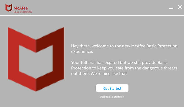
Once the premium trial has ended, McAfee messages the user that we still have them covered, even if their premium trial has ended, and occasionally reminds them about the features they are missing out on

When the user is about to uninstall McAfee, we make a final attempt to tell the user that we are free and list out reasons for them to not to uninstall McAfee
WHAT HAPPENED NEXT?

Data Analytics
While simultaneously working on releasing the next version, everyone was curious on the results of the first release, so we dug in to find out how we did

Reduced Uninstalls
We were highly successful in reducing the number of uninstalls. Compared to the baseline, a significant number of Freemium users retained the product

Retained More Users
We were also successful in keeping our user base strong. Users were not switching to a different anti-virus software
V2 - MIND RELEASE
For the next version of Freemium, a lot of the designs that were initially proposed were implemented and released.
From introducing new visual messages to changing the UI, a lot changed for the next release
NEW WELCOME MESSAGE


We redefined the look and feel of our old McAfee messages and introduced new visual elements, so that the user can actually process what we are trying to convey


Introducing locks on features that the user is not entitled to, in the freemium mode, lets the user know clearly that they only have the basic version and must pay to upgrade


The design had to ensure that the features that were locked, had to be locked throughout the product and various other touchpoints

Clicking on any of the lock icons will initiate a pop up, which lets the user know that they are clicking on a premium feature and will be redirected to McAfee's cart, if they would like to go ahead and purchase

Showing visually how many threats we thwarted, greatly saved a number of uninstalls
WHAT HAPPENED THIS TIME?

Improved Conversion
With the product now fully functional for Freemium, disabling valuable features and clearly calling out what features were free and what features the user had to pay for, improved the conversion rate
Reduced More Uninstalls
Adding visuals to the uninstaller and showing value, further reduced the number of uninstalls. Compared to the first version, a significant number of users retained the product

Improved NPS Score
Adding a welcome message, changing the content to be more friendly, showing value and respecting the user, went a long way and helped improve the 'Net Promoter Score' for our company
SOMETHING MORE RADICAL
Once V2 was released, there was a decent improvement in terms of conversion. After a small break, we wanted to try something more different, something more radical.
The design team got their heads together and thought of an idea, where we give the user a superior user experience and then, if the user does not convert to a paid user by the end of their trial period, we downgrade them to a basic version of the app and monetize through other ways.
This was quite challenging and took some time to convince the stakeholders to wrap the idea around their head. Then it was time for the engineers to start complaining and speaking about the multitude of technical issues they foresee with this approach, not to mention the time and effort for it. Then came along the 'No Risk Nathan's' who were skeptical of this whole idea as no one else, especially our competitors, weren't trying this approach.
After a lot of convincing, concept testing and user feedback, we finally got the green light to go ahead with the project.
RULES OF ENGAGEMENT
-
Provide a superior user experience
This meant that our current product and UI wouldn't do the trick. We had to come up with something better and engage the user to show value, so that they would hand us their cash. We were already in the process of reworking the McAfee user experience, so we used that to our advantage.
-
Do not hurt existing conversion metrics
It's very important, from the business standpoint, that we do not give away our product for free to every user. The goal was to run a test with a cohort and let the users experience the product, and let the ones who want to buy, buy it. We don't play our hand till the last minute to sweep the game.
-
Change the UI
How will the users know that they have lost premium protection? By making it EXTREMELY CLEAR of course; placing locks on features, messaging the user are ideas that have been already tried and tested. So this time we took a different approach and changed the UI of the product completely.
-
Monetize through other methods
As long as the user keeps McAfee installed on their device, we have the ability to monetize through other means. Either by up-selling to the premium product, cross selling to other products such as identity protection, generating revenue through our partner powered secure search and even data monetization.
-
Keep protecting the user
It's not just about the money too, it's also about brand, reputation, morals and doing the right thing. One thing I strongly advocated for was taking care of the user, providing them with 'Basic Protection' at most. Just because we changed the experience for the user, doesn't mean we have to make it a bad one.
V3 - SOUL RELEASE
We had to go all out to provide a better user experience to the user. Rethinking the whole approach, rebranding it with Intel guidelines, making it easy to scan, promoting value to the user of the product, make it easy and accessible for the user to use the different features that come with the product, making it look it was designed in 2016 vs 1776, the works.
There was a lot of content till here and you might have read it or not read it but just to keep it clear, I've added the old experience to keep it fresh in your memory
Memory Pill - The UI before the redesign

To put it briefly, I was glad that we finally managed to move away from this design and replaced it with a much better experience, for a multitude of reasons. To name one, the user had to click on 3 to 4 separate buttons (depending on how they navigate) to start a scan
The new and improved Experience
Total Protection by McAfee
With McAfee, you and all your devices can stay safe from the latest viruses, protect your identity from hackers and the dark web, set device level control, and, protect yourself from spam and malicious emails
Keep me secure
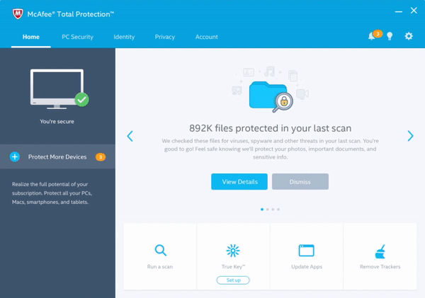
The new experience is tailored to help you secure your device, easily perform a quick scan through shortcuts and show how we keep the user secure by providing a security report
Protect all my devices
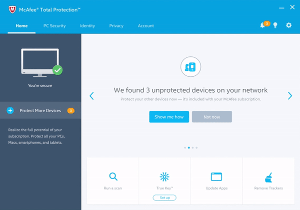
With McAfee, you can view how secure you are and take the appropriate action in one sweep and protect all your devices such as phones, tablets etc. for free. McAfee automatically detects the unprotected devices on your network and identifies them for you to make it easier to secure them
Make it easy to find

With simple navigation, we were able to resurface buried features that protect your device, secure your identity and keep your personal information private.
Downgrade =
/ Bad Design
Just because we were downgrading the user to a basic version of the product, doesn't mean we make the experience pathetic. That would have just lead them to uninstalling the product and telling others how bad we suck (something they already do today so let's not add fuel to the fire). The goal was to come up with a design, which would let the user notice the fundamental difference in the pro and basic versions, let the user manage basic security, and buy the full product easily should they choose to.

Stripping down all the premium features meant going back to the drawing board and reimagining the UI to be simple and functional.
WELCOME SCREEN
The Game Plan

Strategy played a major role in the launch of the product. Making sure we didn't lose out on users who were willing to pay was one of the important rules of engagement. We made sure the flow of email campaigns and 'Buy' messages were not affected. We took a look at the existing data and noticed that the number of people purchasing the product was extremely low on a certain day after the product has expired. That's when we targeted to show our 'Welcome to Freemium' messages. That way we wouldn't lose out on a staggering number of users and whichever users we lost, we would make up via alternate monetization methods.
Welcome to Freemium

We got you covered

It was important for users not to feel confused as to why their UI has switched. We introduced a welcome screen before hand to explicitly communicate to the user that we have downgraded them. This also solved the problem on the legal end too which required us to show some legal and privacy terms as we were going to monetize from other sources.
Am I Secure?

One of the constant feedback we receive in general for security products is that users wanted to know if they were secure or not, that is one of their primary concerns. We made sure we accommodated that user need by clearly calling out the security status right in the forefront of the screen.
1-Click Scanning

I've always advocated in my company that users who buy security products are primarily buying to keep their devices safe from viruses So if we make scanning hard to find and do(not more than a click or two), then we are failing as a product. I've demonstrated that in my design by making scan just a click away. As soon as the user clicks on the 'Scan Now' in the home screen, the scanning starts without asking any further input from the user.
World Wide Web


Along with the basic scan functionality, we made Web Protection a primary feature for the user. This enabled us to monetize through alternate methods. We also introduced a mini tutorial for users to help them understand what exactly it is we do with Web Protection and how we keep them safe. For phase 1, we could not integrate the complete functionality to switch Web Protection ON/OFF from the UI, so we made do with displaying the status and providing information to the user on how to activate it. The next release focuses on better integration with the Web Protection software that would let the user turn ON/OFF web protection directly from the console instead of going to the browser.
Simple Settings

We tried to keep the settings as simple as possible, both in terms of design and content. Providing a brief but clear description in everyday words made users realize the value of each setting and made them keep the setting ON.
What's the Difference?

This was one of the designs where everyone had to weigh in on and give their opinions, right from the VP of the company to the support team. Everyone had their own feedback and wanted to see it incorporated. Towards the end we finally settled on the above design and made a decision to describe what each feature means vs. just naming that feature and hoping the users figure it out. Describing what each feature does resonated really well with users in usability studies.
User reactions
We conducted an usability study to see how users would react to the product, and to simply put it, they loved it.
"Simple, easy to understand"
"Very clean cut nicely designed and organized"
"I like there is not too much information
so I don't get confused"
"The tutorial simply explains what web protection is meant to do, I like it."
"Pretty straight forward - anyone that is expecting basic protection will get what they get"
"More description under each option so you don't have to click in to find out what it does"
The fruits of our labor
Once the new design was launched, we saw a huge win in retaining our users. The number of uninstalls post the expiry period decreased by 40%. This was unseen or unheard off in the company. Even compared to the 'Body Release' and 'Mind Release' (the first 2 releases), the drop in uninstalls with the 'Soul Release' were so high that the project immediately got declared a success. We realized that with the difference between the previous releases and the last one was that users were making a choice to use McAfee over Windows Defender as opposed to simply ignoring our existence. We retained a lot more users who would go to uninstall the product after McAfee expired and convinced them it's a better product than Defender.
DESIGN DELIVERABLES - THE AGILE WAY
Once the requirements were set in stone and we received feedback from early concept testing, it was time to actually start building the product. The CXD team works in sprints and drops and we chunked a few deliverables into each sprint. With our sprints and drops, the team was always engaged picking up where one left off.

My team consisted of an Interaction Designer(Me), Business analyst, Visual Designer and Content Writer
IX & BA
The first drop is tackled by my accomplice and me. We start the specification document, add the flows, wireframes and interaction notes and business rules. The role of the business analyst is to identify all the potential edge cases and document business rules and flows while I can hash out all the details for user experience.
VD & Content
After the first drop, almost all the work is done in parallel. The visual designer and content writer work on the deliverables that IX & BA have finished in the first drop. While the visual designer and content writer work on their first drop, the IX & BA are already working on drop 2. That way, the team is most productive.
Internal Review
Before we discuss or show the designs to members outside the CXD team, we hold an internal review within the team so that all of can discuss about the designs, deliverables and any potential issues. Once we feel all of us are on the same page, we decide to go to the team review.
Team Review
In the team review, we go through the spec in detail with both Product Manager and Engineering. There are usually a lot of action items after this meeting in terms of changes to design and implementation. Once this is done and CXD and Engineering are aligned we move to stakeholder review.
Stakeholder Review
Stakeholder reviews have the biggest audience and are primarily for the big guns in the company to provide their feedback and blessing for the go ahead. Most of the feedback in this meeting is directed towards content and the user experience.
Tools and Processes

As the lead for the project, I was responsible to keep track of all the epics, stories, tasks etc. and document them to see our work load. It also helped us keep track of the deliverables and the due date.
Specification Document
To ensure accurate delivery of the product, our team had to design a specification document which consisted of use cases, edge cases, error scenarios, mockups, interaction notes, content and more. After meeting with both the engineering and QA teams, I understood what made it easier for the teams to build and verify at the same time. A few iterations later, we all decided upon a certain format of the document which worked best for everyone.

The flows we came up with captured every use case, edge case and error scenarios. This was very helpful for the QA teams and our team captured and designed for a few scenarios which the engineering team didn't even think of.

To ensure accurate details of the transitions and animations. I would provide animation guides to the developers with accuracy up to milliseconds. This would ensure delivery of a high quality product and make it seem like a smooth product for users who see the transitions.

The spec also contained final mockups with lorem ipsum and content to the side. Interaction notes were also provided so the development team could know what the product behavior is. Content was the thing that constantly changed and it was cumbersome to go change the mockup each and every time there was a content update. Also developers used to get confused when there was content in both the mock up and content section, especially when they didn't match.
OFF TO A GOOD START
Although it took us a while to get where we wanted to reach, all of us were happy when we did. It was a long journey, a rollercoaster ride if I could put it that way. It was great to work on a project that let me reimagine the strategy of the company. It gave me an opportunity to present my designs to the VP of the company and talk to him about his vision for the Freemium initiative.
Working on this project for a year and half or more has taught me a lot of things -
1. No matter how hard you try, something is bound to change.
2. The best way to defend your design is by design rationale. Everyone feels they are a designer and it's their opinions vs yours, telling them the why's of your design will help move the discussion.
3. Take everyone's feedback with a smile, don't dismiss it immediately (especially in front of them).
4. Focus on the problem first, don't jump to solutions. The problem is that people don't understand what the problem is in the first place.
5. Design reviews are extremely crucial and it's up to me to make sure they are done right.
6. Building a relationship with stakeholders, PM's, engineers will help in more ways than you can imagine.
In Retrospect
If I had to look back and think what I would do differently, I would definitely optimize on the communication between CXD deliverables and engineering releases. That being said, I am proud of what we could accomplish and am excited for what this holds in the future. Retaining such a huge volume of users and protecting their devices will garner a lot of trust and goodwill if done right.
Now is the time to continue to keep learning, experiment with different ideas, be bold and take risks that puts user needs before business needs. This can't be done alone by myself or the CXD team, we would need the cooperation and support of the entire company.