THE OPTIMAL CART
A checkout experience that’s good for the User & the Business
McAfee - To comply with NDA, and not lose my job, I have removed or obscured all confidential information.

THE BEGINNING
There comes a time in every designer’s life when they are put in an exceedingly difficult situation and asked to do the impossible. This was one such time. It all started when the VP of our business unit setup a meeting out of the blue and invited a bunch of folks, me included, and this is how it kind of went down.
Disclaimer: All characters in this sketch are fictional & used for storytelling purposes only. Resemblance to any person living or dead is purely coincidental. Actually, that’s not true, this is really how it went down.
VP
"Thanks for coming everyone. I’ll get right to it, I’ve seen the current checkout process, I don’t like the way it looks and neither do I like the metrics. We need this to change, and we need this to change now."
15 minutes later after multiple people stating their views on this
VP
"Look, I am not taking ‘NO’ for an answer, we are changing the checkout and cart experience and this needs to happen fast. I’ve invited all the folks to this meeting who will be taking the lead on this initiative and we need to come up with a plan now."
ME
" "
MG
"Oh then you must have invited Gunner by mistake, he’s not the designer for the cart. It’s M."
(My Manager)
VP
"No! I want Gunner to take the lead on this, I want the A-Team for this project. Based on what I’ve seen from your team so far, I feel he’s the right choice to make this happen."
ME
"
"
MG
"That’s fine, I can talk to M about this and we can sort this out."
A few moments of awkward silence later
VP
"So, it’s settled then, let’s hustle guys. Does anyone have any other questions?"
EM
"So what’s the timeline for this project? We have a couple of items to wrap up before we can get started to work on this."
(Engg. Manager)
VP
"6 weeks."
EM
"You mean 6 months right?"
VP
"No, I mean 6 weeks."
A lot of drama ensues at this point, people abandoning their seats and tempers flaring, a lot of issues are brought up but towards the end…
VP
"Ok, now since I got all the other items you are working on out of your way, I think 6 weeks is a good enough time frame to make this happen. And like I said before, let us hustle."
And so, that’s how it began, one of the most exhilarating and exhausting 6 weeks of my life.
THE ONE SKETCH TO RULE THEM ALL

Considering the time frame given to us, we didn’t have a whole lot of time for anything. The engineering team wanted the designs ASAP to scope out the effort. So for the first time in my life, our team went from one single sketch on a paper that I designed to the final visuals directly. It was a step in a different direction for me, I usually work on each and every detail in the wireframes, while covering all the use cases and ensuring all the user flows are intact. Since it was one single paper wireframe, I worked very closely with the visual designer to make sure we have everything right and documented.
IDENTIFY THE PROBLEM(S)
There were a lot of problems identified with the older version of the cart. But the one that stood out the most, was the fact that existing users had to login to their account when renewing their subscription. Since most McAfee users have to renew their subscription annually, they don’t remember their passwords, so when we ask them to enter their password after detecting they have an account, they give up on making the purchase as they’re too lazy to reset their password. That’s a major drop-off.


Other issues were also found, the ‘Buy’ button was placed beneath the fold, i.e., the user had to scroll down to find the buy button to make a purchase, a cognitive impediment.
Users would stop the purchase midway in search of a promo code and never come back to the cart which led to cart abandonment.

In general, the whole process felt long and tedious with the user having to go through 4 steps and then downloading the product or renew the susbscription

The users were left with minimal help with downloading and next steps which made it harder for the user to download and install the product.
In general the whole process felt long and tedious of going through 4 steps and then having to download the product or renew the subscription.
UNDERSTAND THE PROBLEM(S)
Our job was to solve all of the above problems by improving user experience, which would then reduce the cart abandonment, in turn increasing cart conversion, further increasing sales and making everyone happy in 6 weeks. Yup, all that in 6 weeks. It was a herculean task, but we popped our knuckles and got right to it.
First we identified how we deal with todays new and existing customers.
New User
Create Password
Existing User
(No Credit Card Saved)
Reenter Email
or
Enter Password
Existing User
(Credit Card Saved)
Password
Re-Enter Password
For new customers, we ask them to create a password.
For existing customers, we ask them to reenter their email to verify its them or enter their password depending on partner(McAfee comes preinstalled with Dell, Lenovo etc.) requirements.
For existing customers whose credit card is saved in our database, entering their password is a must.
This was the biggest problem to solve, as it had to encompass meeting with different teams and partners and ensure that all the requirements were met. We also had to account for different countries and their laws.
As we kept discussing this topic, we realized how much of a knot we were in, each partner and region had some law or contract or rule that wouldn’t let one design apply for the other.
We took a step back and told ourselves, this won’t make any sense if we roll this out to everyone everywhere. Let’s target one partner, one segment and one region for now, let’s take the results to other partners and show them this method is tested, true and they should adopt it too. Let the data speak for itself.

One Partner - ****
So we
'ed
One Segment - Direct McAfee Consumers

One Region - USA
DESIGN CONSTRAINTS
700px Fold Line
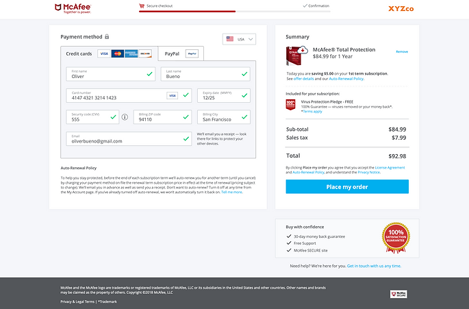
As mentioned in one of our problems, the buy button was below the fold, after looking at some data for screen sizes and resolutions, we found that having the buy button above the 700 px line is the way to go.
Auto Renew Policy
Legal wouldn’t budge on removing the auto renew policy from the checkout flow and have it in the receipt email instead. So we had to make sure it’s in the cart.
Buy With Confidence
The marketing team wanted some graphics that made the user feel confident about the purchase they are making, in terms of security and freedom of returning the product in case they didn’t like it.

No Review Page
The no review page was one of the hardest fought battles between the design team and the upper management, they really wanted to try the no review page even though our entire team advised against it. We believed and the data suggested that whenever you’re making a purchase, it’s best to have a review page. But at the end, we didn’t win the battle, the final call was made to not have a review page which also added the need to have the auto renew policy in the cart itself. If we had a review page, we could have added the auto renew policy there.
Upsell/Cross-sell Area
The marketing team also needed some area to promote other McAfee products which came free or were add-ons to new purchases.
My Only Condition
Because we were streamlining the flows and making the purchase easier for existing users by somehow bypassing the password step, I put my foot down and told the entire team including upper management that the user shouldn’t have to face this issue downstream when they are trying to activate the product. I managed to convince the vice president and his peers that we need a dedicated backend team to come up with a solution of identifying the subscription to the purchase seamlessly.
I told them a good design always solves a problem, it never trades one problem with another.
THE DESIGN
After taking in all the considerations and opinions of multiple stakeholders, addressing all the design constraints, looking at multiple data points and streamlining the flows with different user groups, this was what the first visual looked like.


I truly believe in the process of iterative design, so I sat down with the visual designer and we saw what more could be done to make this cleaner and then landed on this final visual design. Remember, we had to move pretty quickly considering the time frame we were given, so we didn’t necessarily have the luxury of letting the design come to us or go through multiple designs with usability studies.

We even managed to get the buy button within the fold line. We removed a lot of traditional fields like billing address details to make it happen. We absolutely stuck to the most minimalistic information required for the payment to go through not just to save on space but also to ensure the checkout is smooth for the user.
DEALING WITH DIFFERENT TYPE OF USERS
This new design was entirely geared towards the 3 kind of users McAfee has -
-
A new user, who has no prior account with McAfee.
-
An existing user, who has purchased a McAfee product at any point in time and is back to renew it, but, we do not have their credit card saved in our database. We have an account created for this user.
-
An existing user but with their credit card information, saved in our database.
Even within these 3 primary users, there are a multitude of use cases when browser settings, cookies and auto renew come in play. I am going to address the most common ones so this portfolio piece doesn't turn into a lengthy novel.
New Users


This was the easiest flow to deal with and cleanest too, there were no edge cases, no weird errors and no drama. You come in, make the purchase, you download the product.
Existing Users


This kind of user is also relatively easier to deal with since we do not have their credit card information saved. However, to avoid ******** subscription problems which happens to be the number # support call for McAfee, we asked the users to reenter their email for verification. Once cookies were detected in their browser, we auto populated the email field with the users existing account, which would eliminate the need for reentering their email.
Existing Users with saved Credit Cards


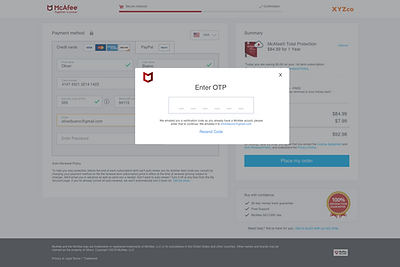
This one was the trickiest. As per legal requirement, we were supposed to ask the user to enter their password. We knew this was the biggest drop off point, so we had to come up with a good solution. I suggested we prompt them for an OTP(One Time Password)/Verification code instead of a password and try that method out. That way, only the registered user would have access to the code, and they would not have to go through the reset password flow, which was happening in majority of the cases.
We did a quick A/B test with two different versions of this for different cohorts in the same segment. One with no password and only OTP option and another with the password field alongside the OTP option.
PayPal & Other Payment Methods


Initially, we had several payment methods to accommodate for all the different regions. I went up to the engineering manager and asked him if we can look at the data for the most used payment methods. After scrubbing through that, we found out that credit card and PayPal were the two most used payment methods in USA. Since we were only targeting USA for now, we made a call to use only those two payment methods which would eliminate a lot of visual noise on screen. We decided to customize the payment per region as we keep going forward vs trying to have a one size fits all version.
New User Receipt


We wanted to improve on the new user experience after purchase. For a new user, who has just bought our product, the natural next step is the download and install process. We added a super cool feature with this new redesign which would show the download location based on the browser the user is using. This really improved the download experience and made the next steps noticeably clear for the user.
Existing User Receipt
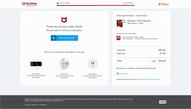

An existing user is one who has the product already installed on their device but is trying to renew their subscription. After the user renews their subscription, we always ran into issues of the subscription not syncing on time after purchase, or, running into some weird error that only a support call could fix. I wanted to end this cycle once and for all. And so, I advocated for a sync subscription feature. In an ideal state, as soon as the purchase was made, the token would be sent out and the token would invoke a call to the McAfee subscription locally on the users' device and immediately sync that subscription. But that wasn’t happening, so I suggested we have, similar to the download feature, a button which would download a small '.exe' file that would manually invoke the users' McAfee console and force it to check for the status of the subscription and update it.
Everyone including the VP thought this was a stroke of genius and it would solve this issue once and for all, I honestly felt, why was I the one who had to come up with this solution when we have been facing this issue forever.
However, due to the 6 week time crunch, this feature didn’t make the cut since it was a lot of engineering effort but made it in the next release. So, for most of the users, we had to have steps written manually.
But nonetheless, this one solution really made a difference and there was a statistically significant reduction of support calls for this particular issue.
Multiple Products in Cart

A lot of data driven decisions were made in this project vs opinions, which I loved. One of the design restraints we were enforced with was the Buy button had to be above the 700px line. That proved to be challenging when there were multiple products in the cart, even if you had 2 for that matter. This pushed it below the 700 px line, we tried different design options like having a carousel for the products in cart so the buy button would still be above the 700 px line but none of them felt right. We didn’t have a review page to begin with, so if we kept some area hidden of what the user is actually trying to purchase, it would make the experience bad and in turn would deviate the user from trying to make the purchase and search for their products instead. So, after looking at the data and finding out that more than 80% of our customers just buy a single product, the decision to have the buy button below the fold for multi-product buyers was super easy to make.
Multi Product Receipt

Similarly, we had to address the design of the receipt for the multi product users. Traditionally, whenever the user bought multiple products, we just had a button to login to their 'MyAccount', which did not necessarily provide any help or further instructions on next steps. I told the team, “This user just spent more money than your average one, we should make it easier for them and not the other way around”. So we enhanced and improved the design of the receipt page and customized it to the products they purchased.
Pop-Ups


Since we cleaned up the design quite a bit, a lot of legal, marketing, and promotional text wasn’t being clearly shown. We introduced icons for them and if the user clicked on it, all the information was shown in a pop up.
Error Handling


With the new design, we introduced both local error handling for text fields and global level for higher level errors.
Edge Cases - ******** Subscriptions

With any product, there will always be a few edge-cases. McAfee is notoriously famous for creating ****** ******** subscriptions to the same user. If an existing user goes and purchases a new subscription which is different from what they have, it creates a different subscription for them. A different team was handling to deal with that issue and how to resolve it but we wanted to let the user know that they have a different subscription at least and let them pick the one they want to renew vs the traditional method of renewing which has a closer expiry date. This led the user to verify which subscription they had on their machine and renew the right one and become aware of the fact that they had multiple ones.
Omitting content due to NDA, but keeping it so I can talk about it during portfolio reviews
Mobile View

We optimized the cart with responsive design for mobile view too. We weren’t constrained to deal with the fold line in the mobile view since there’s not a huge segment of users who purchase McAfee products through their mobile devices. A suggestion for a sticky footer with the 'Buy' button was made, to accommodate the button always being at the users eye level. I advised against it and convinced them saying there could be a lot of fat fingered purchases and since there is no review page, there would be no way for the user to undo their mistake which will lead to a support call. Most users purchase the product on the laptop when they see a message showing that their McAfee subscription is expired or is about to expire. Nonetheless, we made the experience as good as on the web.

Receipt Email

We wanted the user to have a singular experience throughout the whole purchase and download flow. So, we even updated the receipt email for the user to match their experience in the cart vs using the same old receipt email which looks and feels different. This was also achieved in the 6-week time frame. For new users who just purchased a McAfee product, we provided a way for them to setup their account and manage their subscription.
THE AFTERMATH
First, lets' address the non-believers in the room. We actually managed to release the redesign in 6 weeks, really, no delays. Once the engineers hit the launch button, my manager ordered the entire design team to take a day off. But even on our day off, all we could think about was how would users respond to the new design. We never got to do a proper usability test for it, apart from the guerrilla testing we did in our cafeteria with our own employees. All the late night meetings, the arguments, the brainstorming, we were just hoping it'll pay off in the end. It literally felt like we were back in school and were waiting for the test results to come out, and when they finally did, this is what happened....
1. The conversion rate had a 22% increase on our website. That kind of result was unheard of at McAfee. A lot of people didn't believe it and thought it was an anomaly. So they waited for some more time and rechecked the data, and, it was still around the same increased conversion rate. That's when we all let our guard down and started celebrating. Our VP threw an exclusive party for the team that pulled it off and needless to say, the design team, was well applauded and praised.
2. The downloads for McAfee products improved significantly with the redesign. Traditionally, a lot of users would just buy the product and think that's the end of it. They would think they are being protected. Due to lack of clear cut instructions that they had to download and install the software, a lot of users would pay for the product and never install it.
3. The subscription renewal improvements led to the reduction of support calls, which saved the company good $$$$. Manually invoking the users' client to force a subscription check and renewing it, made life easier for a lot of users. Personally, I take pride in the solution for renewing the users' subscription. That was more of an achievement for me than improving the conversion rate.
4. Users requesting for their password to be reset, while checking out, became virtually nonexistent. The OTP only method was the biggest success. From the group of users who had the option of OTP or password, almost all of them chose the OTP route.
5. The lean & mean visuals made the cart look very next-gen, everyone was happy with the way it performed. Although there were a few complaints that the text size might be too small. We decided to look into the issue for the next release.
Honestly, that conversion rate alone was enough to satisfy everyone, but for me, it wasn't about that. I truly believe that it's the culmination of the many major and minor details that you work on, which enhances the user experience, which in turn adds up to the improved conversion rate. So my focus while designing was simply to make the users' life easy, the right way.
Conclusion
As I mentioned, this was exhausting but also exhilarating. We learned a lot of new skills, how to take a loss and not feel defeated, how to hit a roadblock and push through it, and how to challenge decisions and rank, while gaining respect and not offending one.
Working with my team on this project, we developed a special bond. We became friends from coworkers. So not only did the company win, I did too.
There are a few more things that I would personally like to further improve in the cart. More experiences we would want to touch on and enhance. Challenge conventional eCommerce strategies and introduce revolutionary ideas. But that, is a story for another day. For now, this was a very rewarding experience.